- Joined
- Jul 21, 2014
- Messages
- 10,414
- Reaction score
- 164
Following on from the project referred to here https://www.thewoodhaven2.co.uk/threads/sliding-dovetail-proportions.9972/
I thought it best to expand on the project in this board.
I started with a scale drawing of the target location. A completely blank canvas. Permanently open door way to the kitchen, architrave, deep skirting and ceiling cornice and otherwise only a light switch and power socket for features.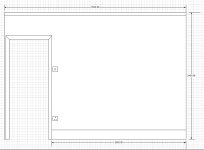
The idea is to make something to occupy the space and for use to display family mug shots and a few knick knacks (dust catchers )
)
My earlier guess at 8' width would be too tight a fit. nearer 1950-2000mm seems about right leaving 300mm gap at each end.
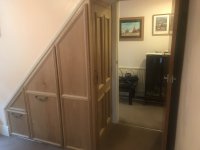
It needs to fit in with the panelled design on the opposite wall.
Looking at dressers online this is the sort of thing
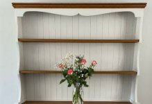
with panelled backing and not painted but showing oak wood grain.
Local management quite likes the curved details but I'm still to be convinced of the scalloped sides.
My first thought were something like this.
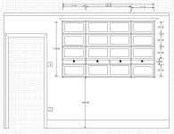
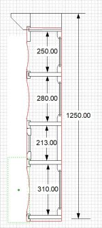
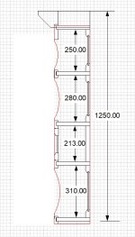
With the panels at the back and a row of faux drawers to try and prevent it looking like a set of post room pigeon holes!
The panels will be firmly attached to the rear edges of the shelves adding quite a lot of rigidity
I've not drawn the scalloped detail.
I've taken on board MikeG's suggestion of verticals and breaking up the width in 1:2:1 proportions.
Not sure about the verticals so a click of the mouse and this is what it looks like without them.
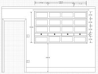
Local management appeared and asked why 4 panels across the width? Well that came from the 1:2:1 idea.
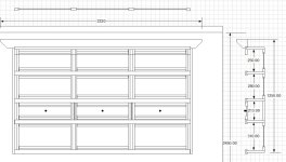
How about 3 panels she asked? which now looks like this.
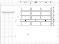
I seem to recall a method/ design practise of having gradually increasing spacing between horizontals - mainly applied to chests of drawers? Next job is to search for this detail.
In the meantime I welcome any suggestions, as based on my engineering background symmetry rules and I'm not really wired up for artistic and aesthetic detail
Bob
I thought it best to expand on the project in this board.
I started with a scale drawing of the target location. A completely blank canvas. Permanently open door way to the kitchen, architrave, deep skirting and ceiling cornice and otherwise only a light switch and power socket for features.
The idea is to make something to occupy the space and for use to display family mug shots and a few knick knacks (dust catchers
)My earlier guess at 8' width would be too tight a fit. nearer 1950-2000mm seems about right leaving 300mm gap at each end.
It needs to fit in with the panelled design on the opposite wall.
Looking at dressers online this is the sort of thing
with panelled backing and not painted but showing oak wood grain.
Local management quite likes the curved details but I'm still to be convinced of the scalloped sides.
My first thought were something like this.
With the panels at the back and a row of faux drawers to try and prevent it looking like a set of post room pigeon holes!
The panels will be firmly attached to the rear edges of the shelves adding quite a lot of rigidity
I've not drawn the scalloped detail.
I've taken on board MikeG's suggestion of verticals and breaking up the width in 1:2:1 proportions.
Not sure about the verticals so a click of the mouse and this is what it looks like without them.
Local management appeared and asked why 4 panels across the width? Well that came from the 1:2:1 idea.
How about 3 panels she asked? which now looks like this.
I seem to recall a method/ design practise of having gradually increasing spacing between horizontals - mainly applied to chests of drawers? Next job is to search for this detail.
In the meantime I welcome any suggestions, as based on my engineering background symmetry rules and I'm not really wired up for artistic and aesthetic detail
Bob